WEBSITES Design & Development
-
Reto CDMX
Designed, developed, and maintained Reto CDMX hackathon's website using HTML, CSS, JS, and Adobe XD.
-
FCBS International Ltd. (Conceptual)
Designed 2 concept websites to replace the current outdated website.
-
FIBS Ry
Re-Designed, developed, and maintained FIB's website using HTML, CSS, JS, and Adobe XD.
-
Ultrahack Partners
Designed their Partner's page with Adobe XD.
-
Ultrahack Main Page (Conceptual)
Designed a conceptual Re-Design of Ultrahack's main page as a side project to Ultrahack's partner page.
-
Henrik Jansson
Designed and developed this photographer's portfolio website using HTML, CSS, JS, and Adobe XD.
-
Nordicforestpaper
Designed and developed this company's website using HTML, CSS, JS. (One of my earlier websites)
-
Nordicforestpaper 2.0 (Conceptual)
Designed a conceptual landing page header for a redesign of Nordicforestpaper's website.
-
Paper Doctor (Conceptual)
Designed a conceptual website design for a paper industry consulting firm.
-
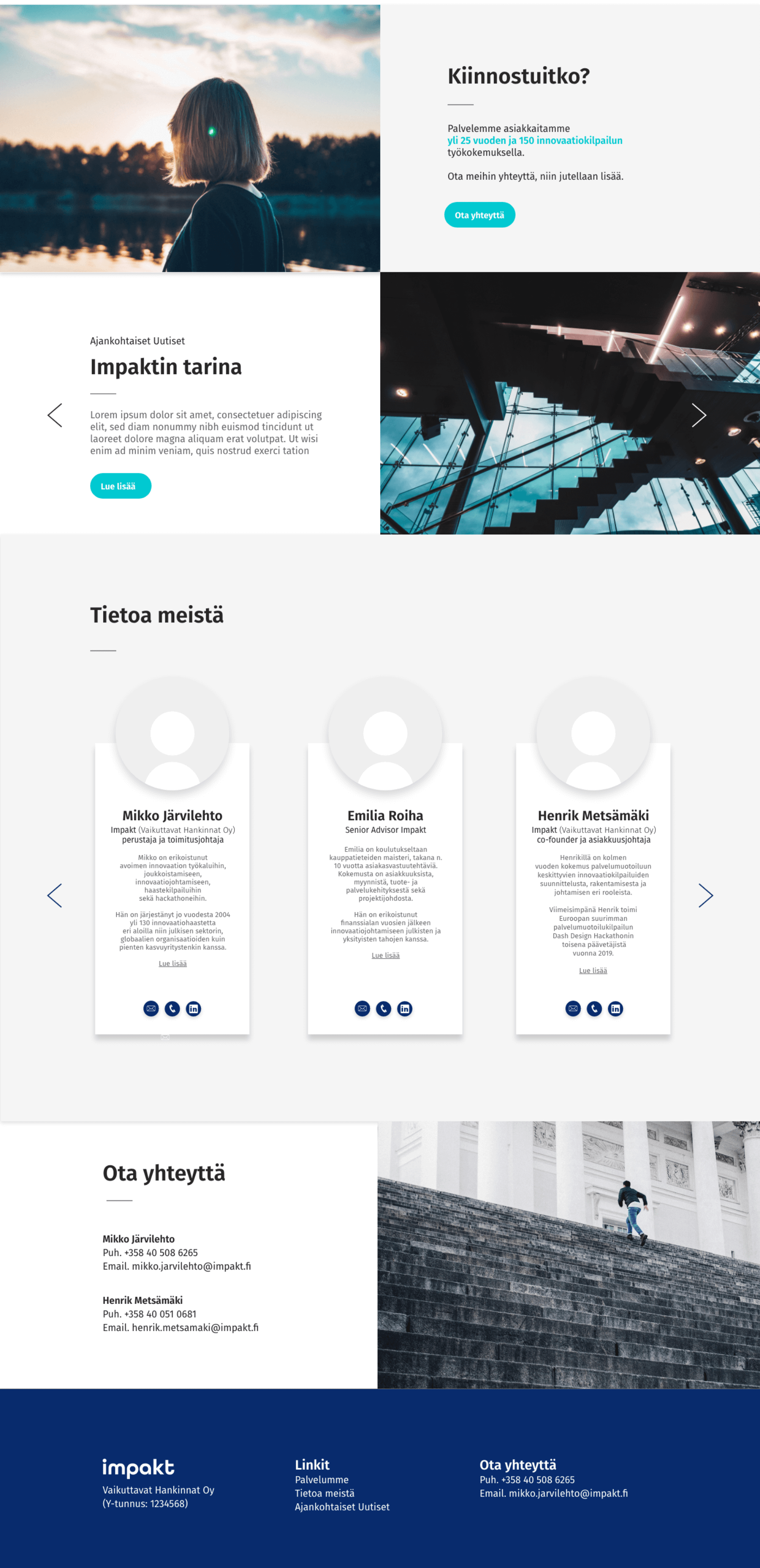
Impakt Oy
Co-Designed but mainly developed Impakt's website using HTML, CSS, JS, and Adobe XD.
-
Chiang Khao Restaurant
Designed, developed, and maintained a restaurant's website using HTML, CSS, JS, and Adobe XD.
-
DOTR (Conceptual)
Designed a conceptual landing page and product page for a jewelry start-up based in Singapore.
APPS Design
-
xJourney
Designed a full-fletched wireframe of a health app for StuDisco.
-
Oras App Challenge
Designed a markup of a data representation app for a Junction hackathon challenge 2021.
-
HKScan App Challenge
Designed a dashboard app for a food journey visualising challenge at Junction Hackathon 2020.
-
BCG Energy Saving challenge
Designed and Coded an app for an energy saving challenge by BCG at Junction Hackathon 2022
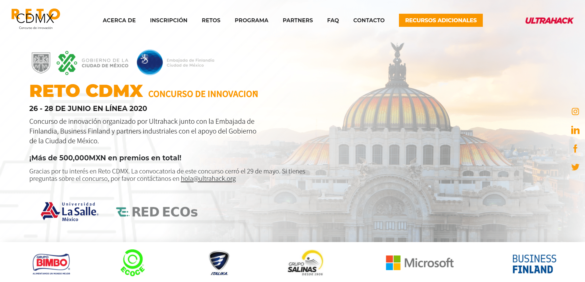
Reto CDMX
https://www.retocdmx.com/
This website was origionally meant to be a one pager for a hackathon that Ultrahack was organizing in partnership with the Mexican government. The requests were meant to be done at most in 2 weeks, which I promtly did. However, there were many complications with the content and sponsorship demands, such as the logo placements and text placement. In the end, the website actually looked very cluttered and colourwise poor, but the job was done.
CHALLENGESThere was a clear outline of what they wanted on the website, however challenges arised when new sponsors of the hackathon requested their logo placement on the website. When you all of a sudden have new sponsors sending you requests for logo placement, it starts to get very hectic. I had a designated section of the website for all the list of sponsors (the sponsor's section). However, many of the bigger sponsors were unhappy, and wanted theirs on the header, which by design was not meant to contain more than 5 logos. Additionally, the sponsors were unhappy that their logos were white, which by design was better for the colour map of the website. So, I had to put the original colours of their logos back, and this made the website look less than satisfactory in my opinion. Some companies such as Microsoft required a banner that they had to be put between sections of the website, with the colour blue instead of orange, and mixed with green from the government logos clearly made the colour map quite disorientative.
Some of the components of the website were also added last moment, which made the completion of the website delayed several times. The disorganization of the content, sponsors, and demands from them made this website design and development that much harder. But in the end, I got it done and eveyrone was satisfied.
FCBS International Ltd. (Conceptual)
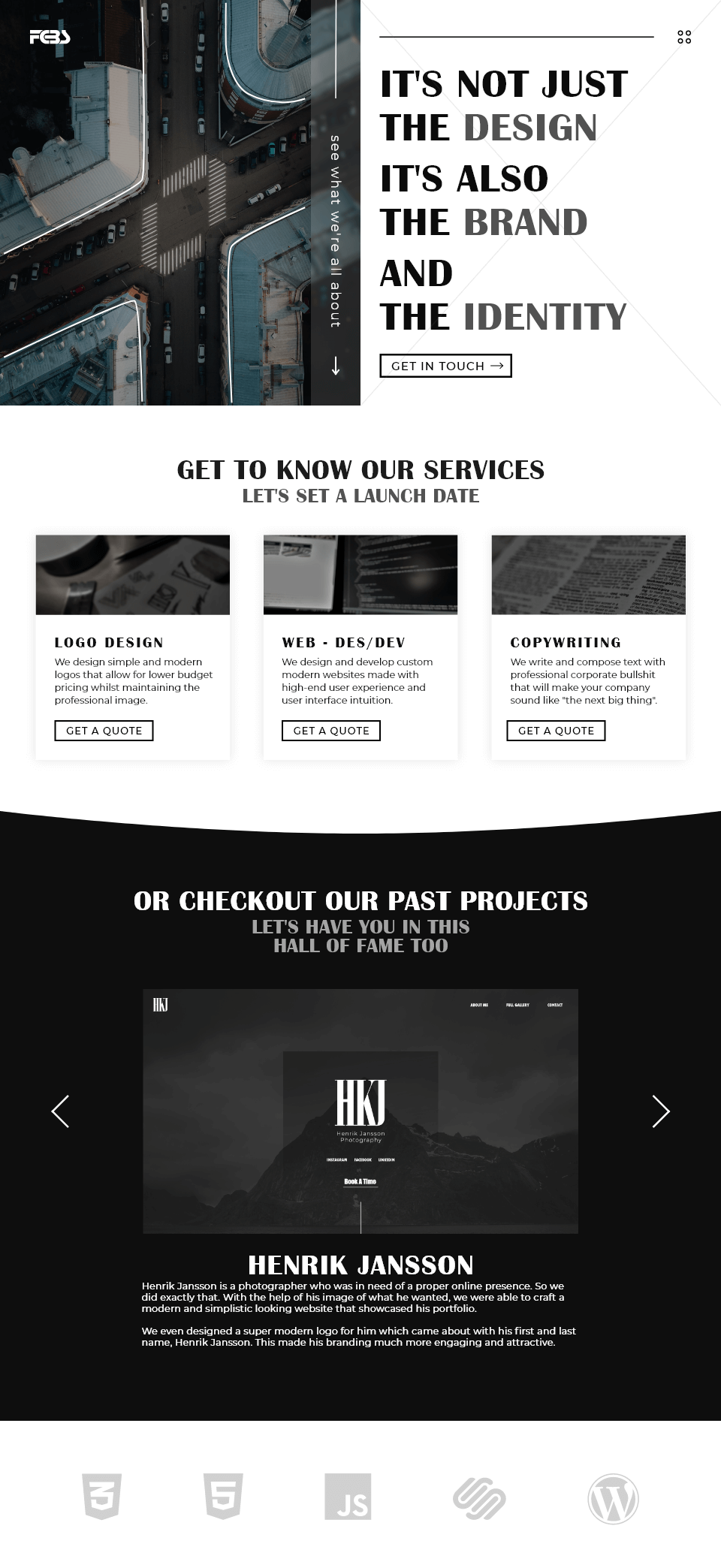
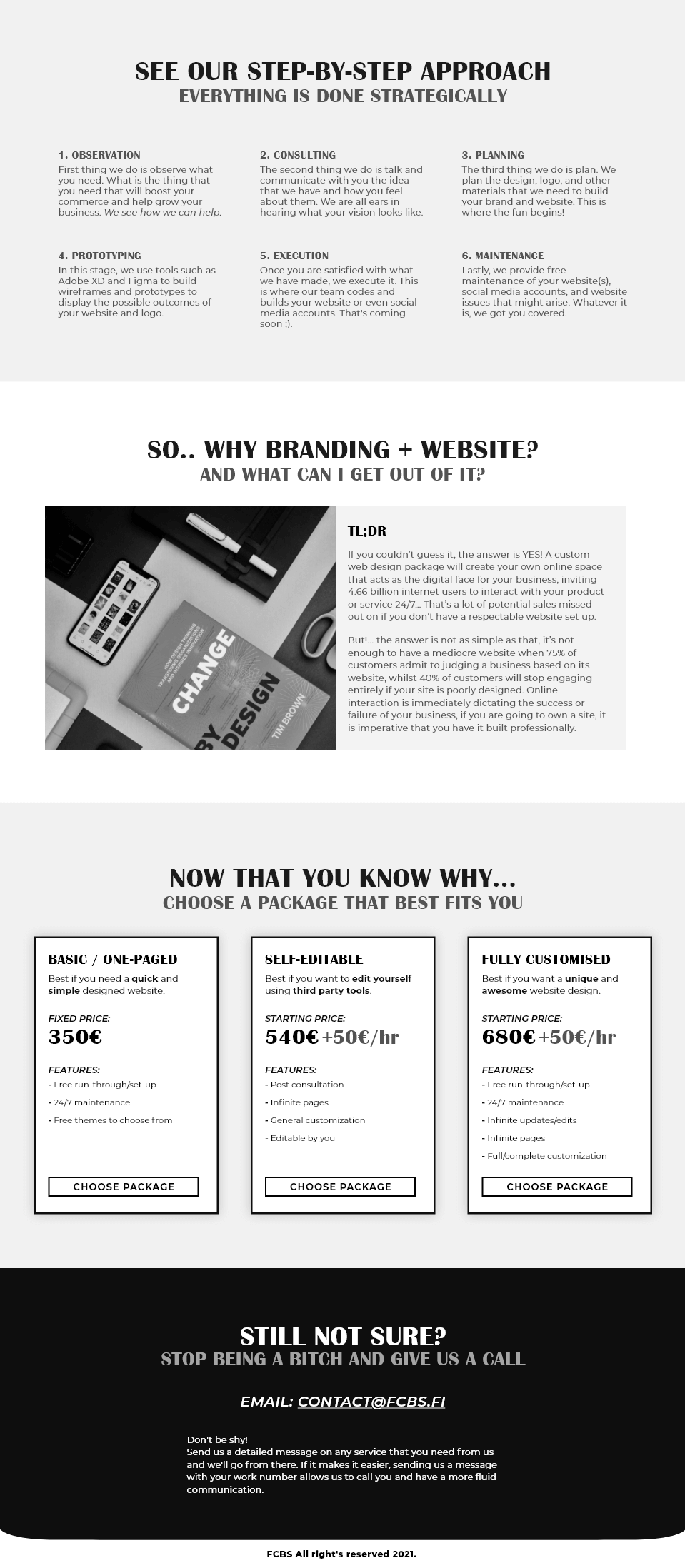
FCBS's is the company that as a freelancer I used to work with clients. This company used to do language and publications related work, however due to my relationship with this company, I have a say in the services they provide. Thus, I thought I would re-design the website to contain relevant information. The still-standing website is quite basic and somewhat outdated. My idea is to change the theme of the website, have it more modern yet classic.
NOTES/THOUGHTSI actually made two design themes. The first one that you saw was meant to be a modern yet classical design. I tried to achieve this with a black and white theme with both sans-serif and serif fonts. The structure of the website is very straightforward and some components were kept but upgraded (service section). The whole idea of the design is to get the viewer to get in touch with FCBS for service request.
The second design is actually an older one, It has a different colour mapping that follows the company's logo's colours. This design is much more modern and brighter as the red and dark blue complement each other nicely. The service sections as you can see are around the same from both design as I wanted it to have reference back to the current old website. The bottom has a simple past-project selection to check out. Nothing more to this design.
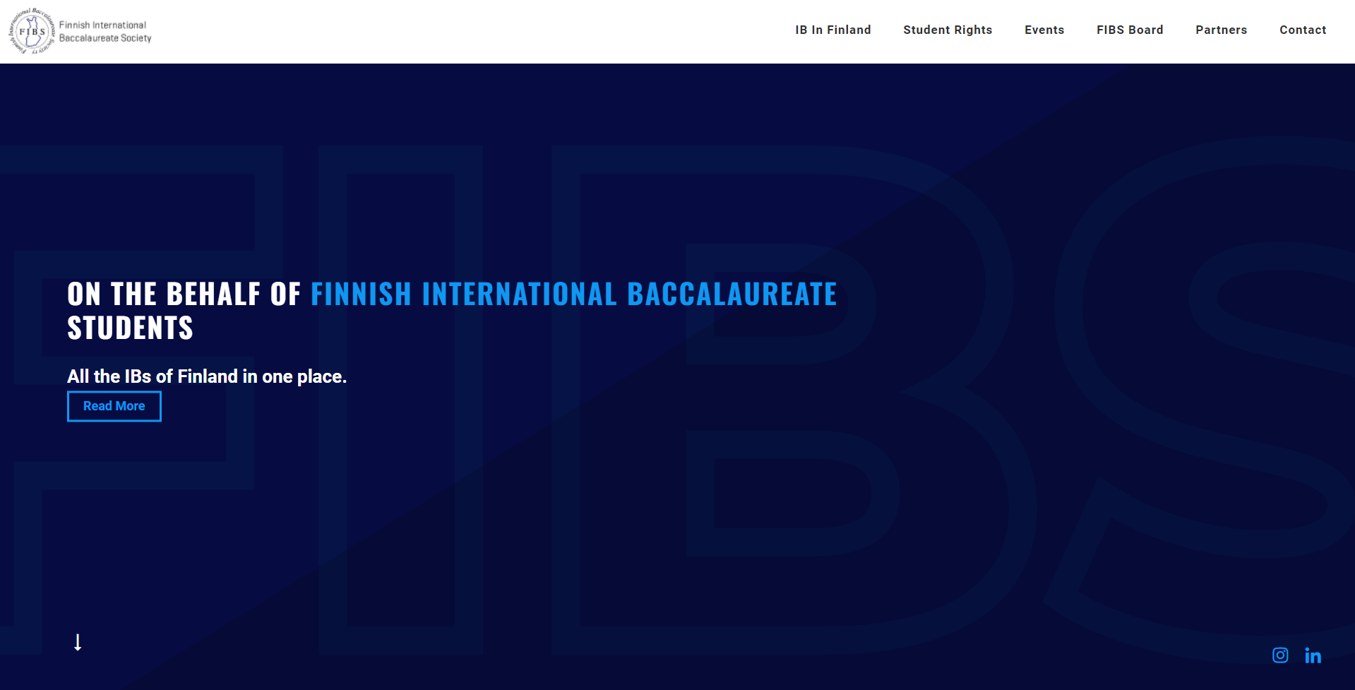
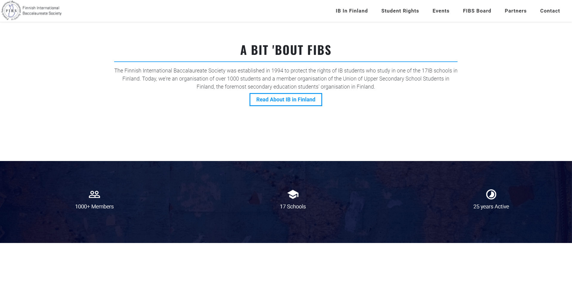
FIBS Ry
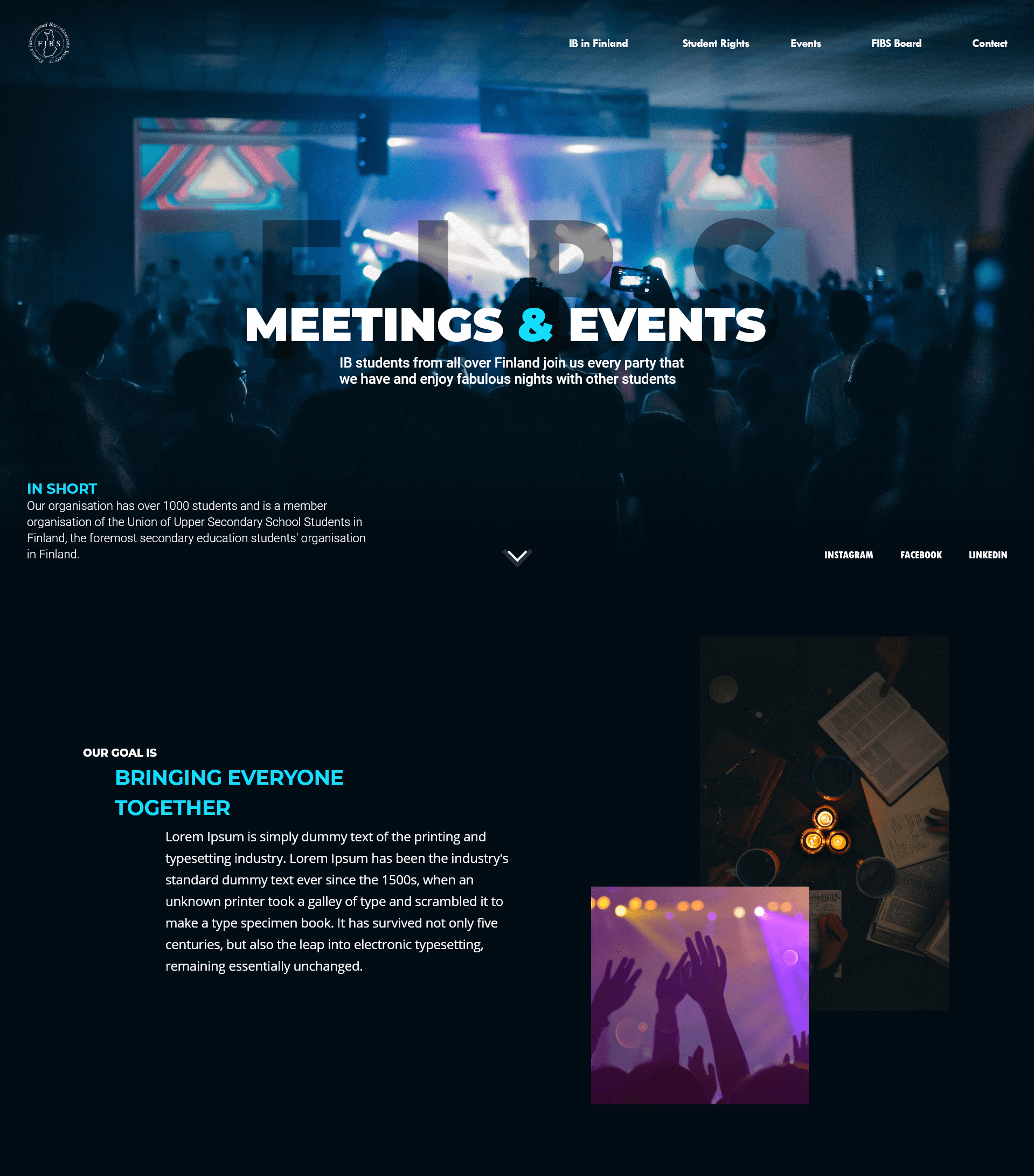
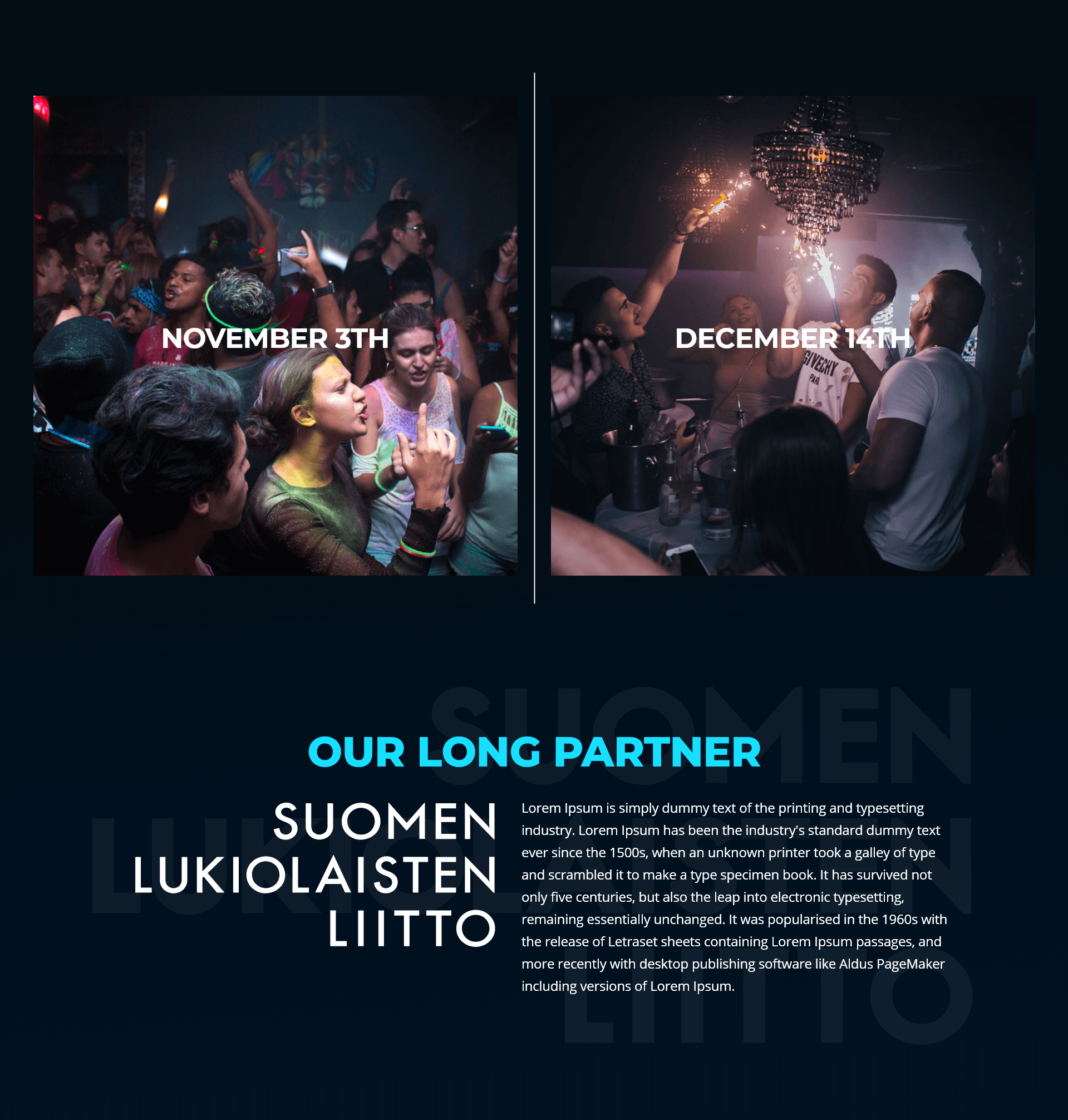
FIBS is an organization that I was a part of as a board member between 2018-2020. They desperately needed a new website since they had not touched nor updated it since 1015. I originally came up with a very basic straight forward design that looked like a template from wordpress. You'll see it at the bottom btw. Anyways, I came up with a newer blue themed website design since their logo was a deep sea blue colour.
NOTES/THOUGHTSThe header of the landing page was one of the coolest ones I have made. There are 3 layers to it: the background, the middle ground, and the foreground. The background was the stage and some of the audience, the middle ground had the closest audience, and the foreground was the text. The cool thing, is that these three layers scroll at different speeds, giving the effect that when scrolling down; you are in fact descending under the crowd floor. I wish this website was still up, but it isn't anymore as they could not afford my design lol (I was doing it for free). Everything else on the website was very straight forward with nothing THAT interesting to show for.
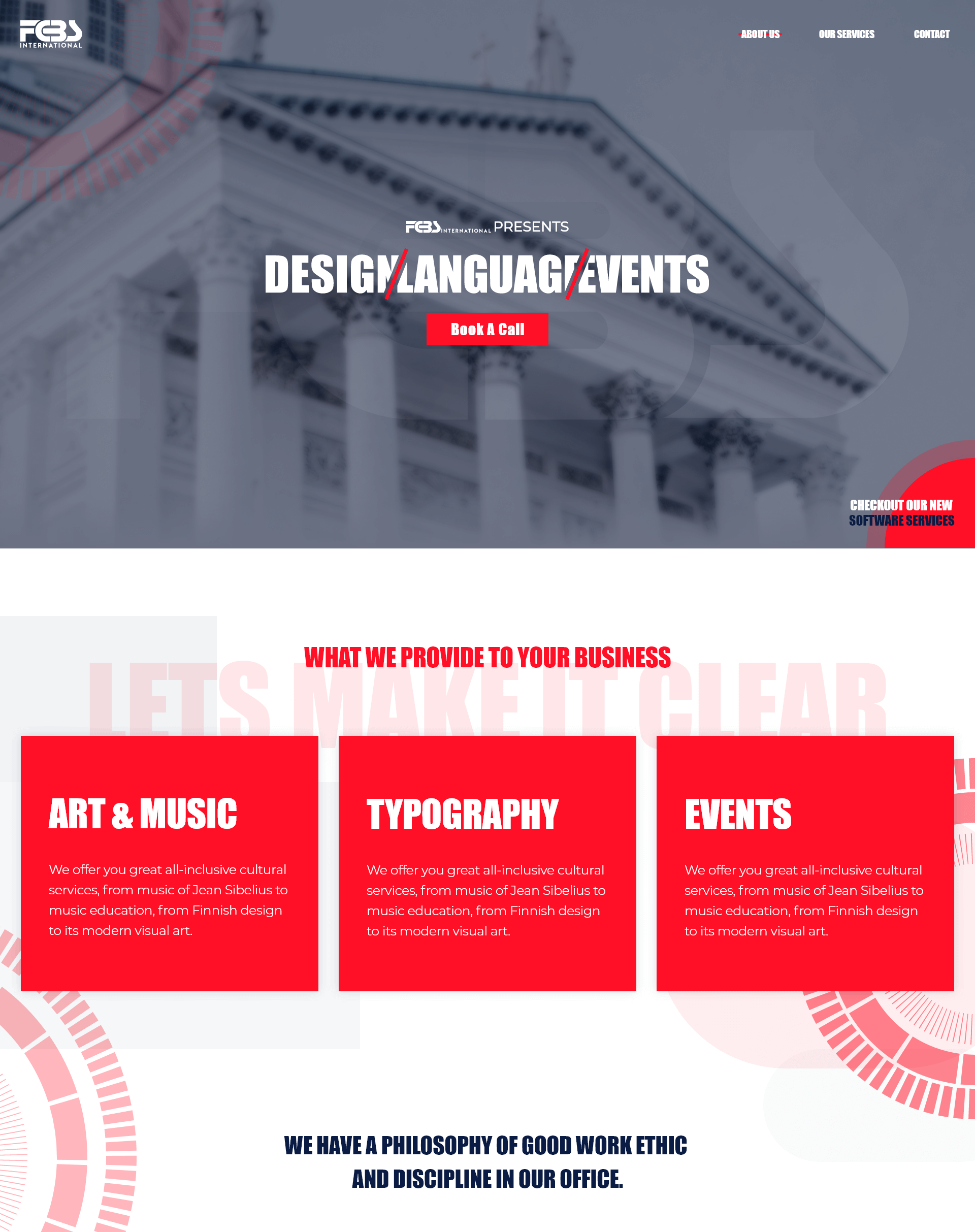
Ultrahack Partners
https://partners.ultrahack.org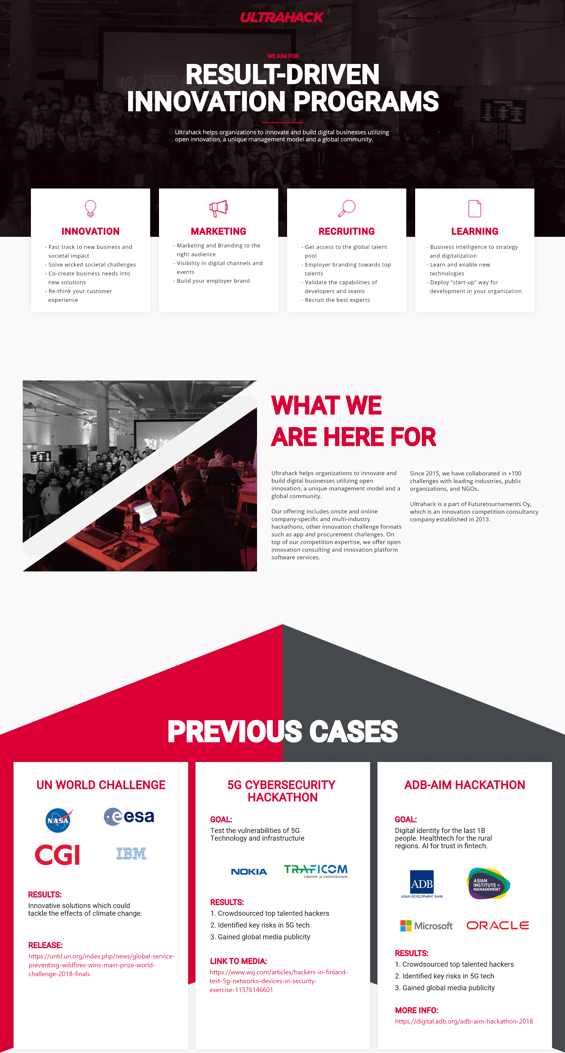
When I worked as a freelancer for Ultrahack, I did work on the RetoCDMX hackathon website as you saw above. But, I also worked on their "Partner's" page as they were in need of one. They requested that I'd make a design in less than a week as they wanted it asap. They had a previous design thought that they said I could refer to if I needed to, otherwise there were no design boundaries. So, I came up with a simplistic design that was meant to show off what the company sells as their services, as well as past projects that would grab the attention of the reader quickly.
NOTES/THOUGHTSSome components in this design can be seen in a lot of my other design. Particularly the "services" section which in this design is in the header. For me, in principle, the services section should be as straight forward as possible; laying out all of the services as compactly as possible. So as design choice, I placed all of this in the header. The rest of the content was quite simple. Nothing complicated. The contact section was designed the way they requested. i.e. The contact form and the left column content.
Ultrahack Main Page (Conceptual)
Before designing Ultrahack's partner's page, I thought they asked me to design their main page again. I promptly accepted this as it would mean my design would be on their main page. Exciting! However... I misunderstood, and what they actually asked was a design for their partners page. :(
Anyways, I was able to get some design done for their main page which now is a conceptual design as it was not used.
NOTES/THOUGHTSAt the time, I had taken most of my best design component ideas and thrown it onto the website. The header in particular had some resemblance to the still old-current website that they have. I wanted the website to main look good, but at the same times how all of the information that was needed. For example, the upcoming events, as well as what they are all about. The structure is quite straight forward, as it goes down, you see the upcoming events as well as why they exist. But it was the component design that I really tried to make modern and as if there were layers. So basically, texts or images in the components that you see layered would scroll at different speeds giving it a layering feeling.

Henrik Jansson
http://henrik.fcbs.fi/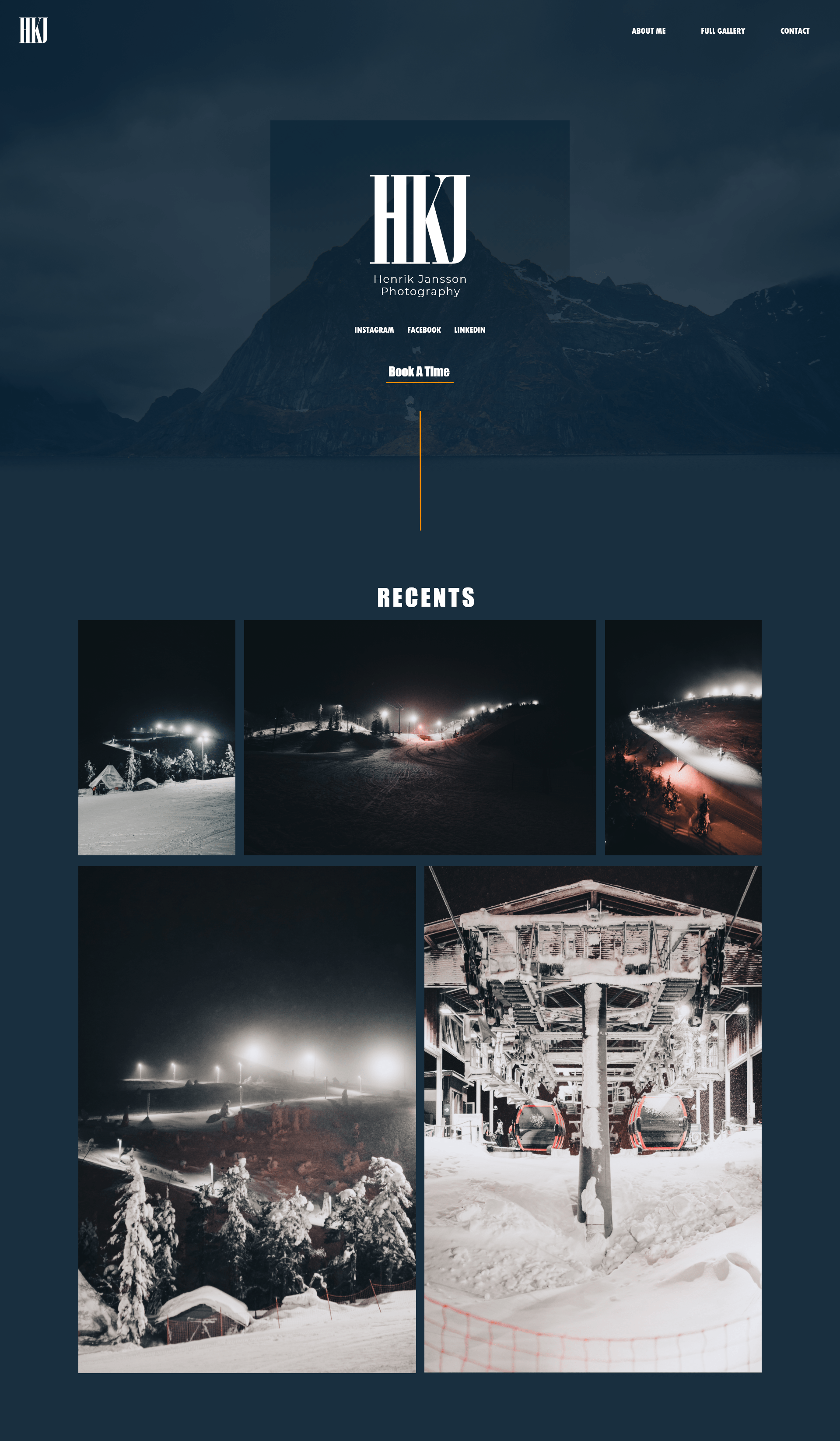
Henrik is a friend of mine and an excellent photographer. I felt the motivation to create him a portfolio website that would be dedicated to his latest photograph albums.
NOTES/THOUGHTSThe general design itself is nothing that special, but it is the header that I mainly focused on. I wanted it to be modern, characteristic, and elegant all at the same time. The colour is in the shade of his favourite colour, and the structure is very straight forward. This website is almost more like a directory than anything else. Btw, the website doesn't hold any more pictures than on the landing page and
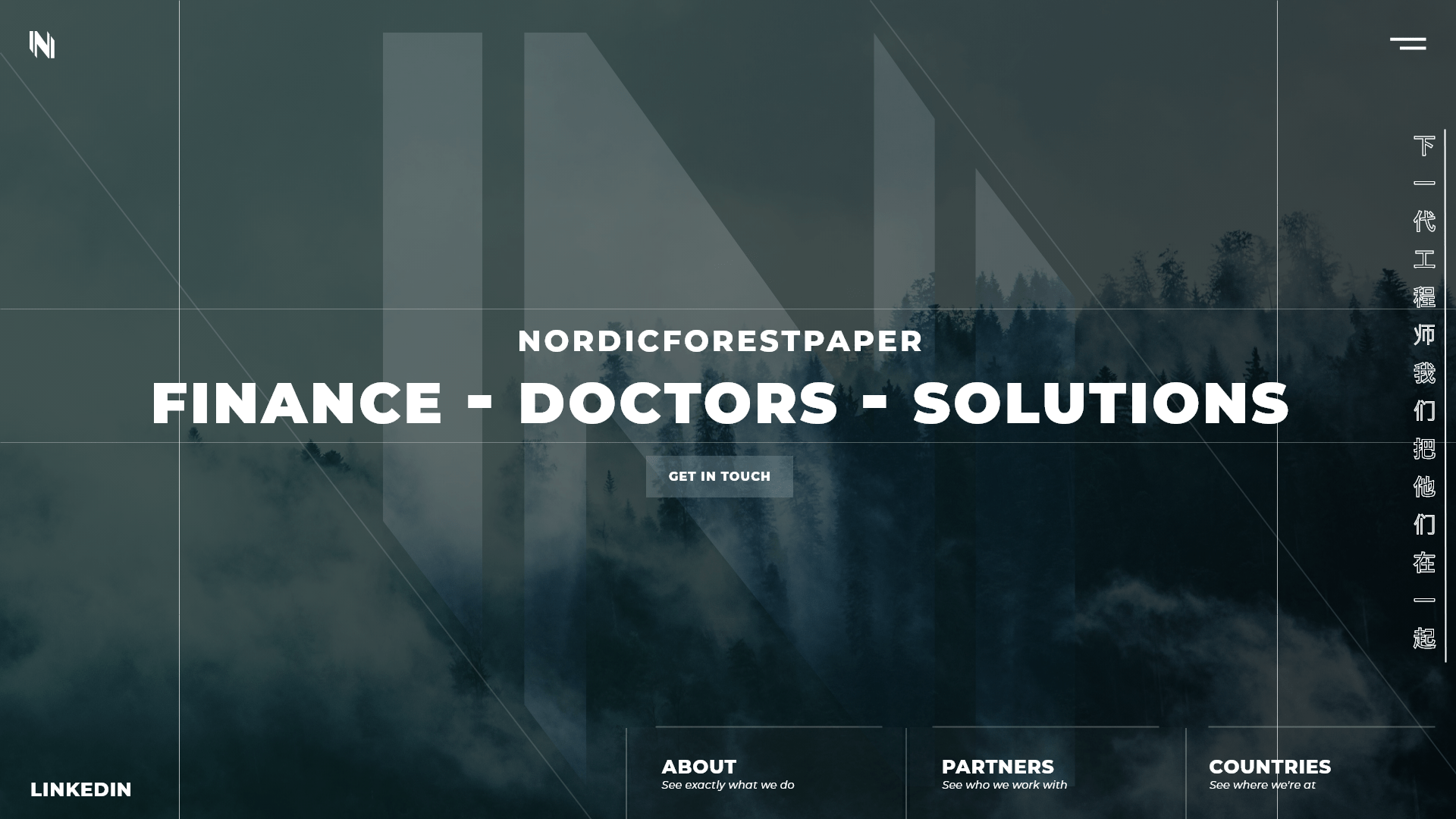
PLEASE DO NOT DOWNLOAD OR USE ANY OF HIS IMAGES WITHOUT HIS CONSENT.Nordicforestpaper
http://nordicforestpaper.com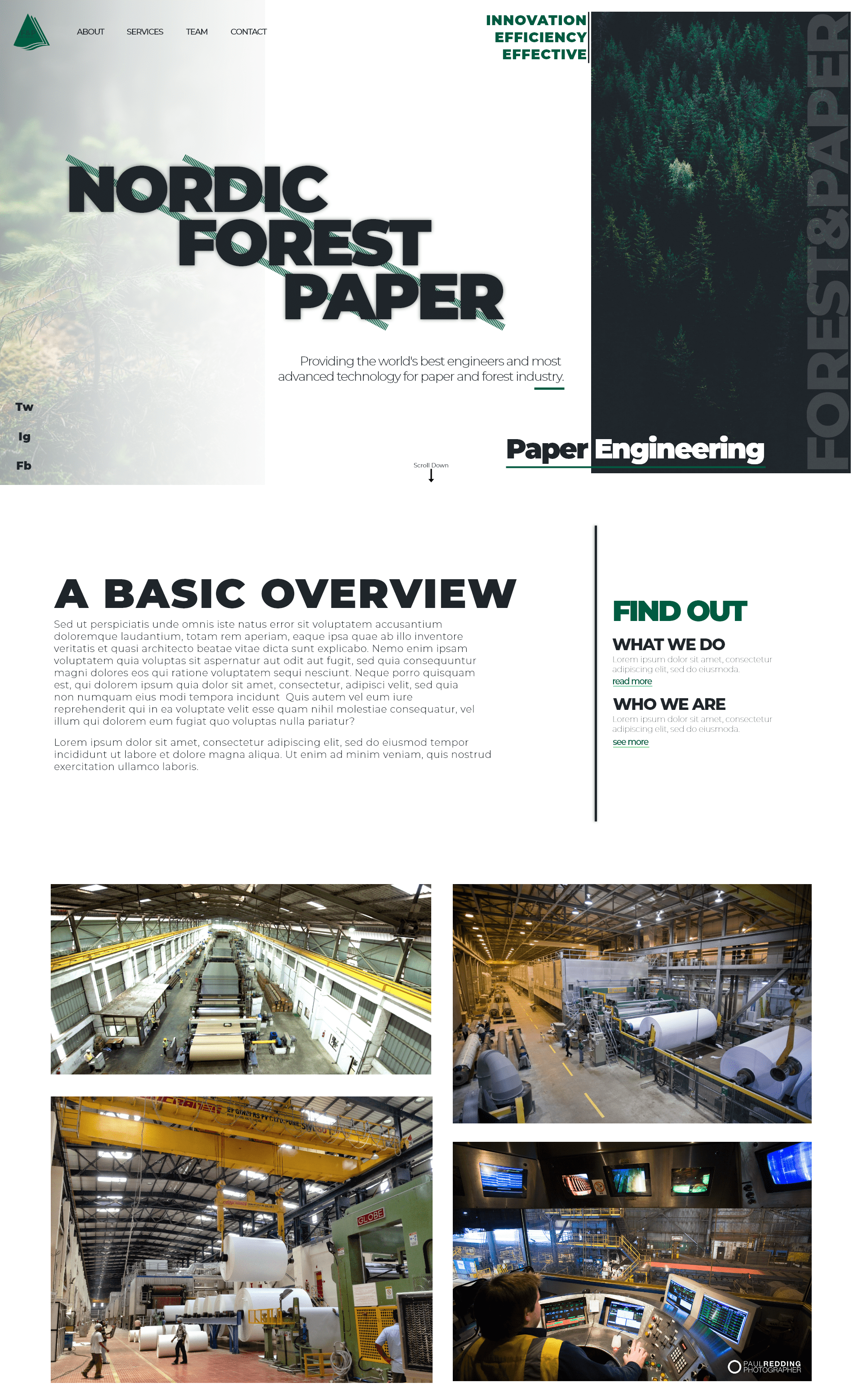
NFP was one of the first website that I designed and made for a company. For this, as much as I can recall, it was a free design with no boundaries. I had started making websites a year prior, thus if you check the website, it doesn't really look that good...
Anyways, here you get to see how much I have developed with my past designs and developments.
NOTES/THOUGHTSYou can see that the colouring isn't that good, quite dull and boring. The structure isn't that amazing as content is lacking. Possibly, I had already experimenting with layering as seen in the header and contact section. But you can see the logo, the navigation, and mid section are quite poorly designed.
Nordicforestpaper 2.0 (Conceptual)
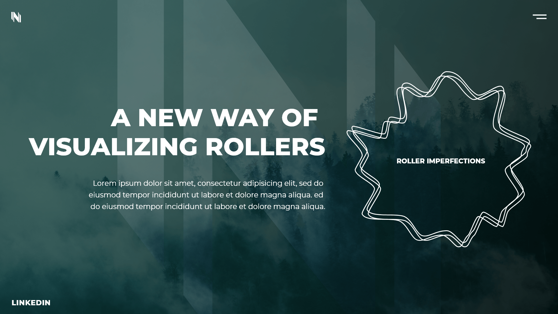
This one isn't complicated at all. This one I remember seeing the current old Nordicforestpaper website design and feeling very bad that they still have my ugly design I made for them. So, I decided to make a concept website that would be much more modern. This design is fully thinking of what looks good to the eye, and not functionality or following any content. I'm putting this on here just to show how I would update an old work of mine, and how in this concept design, I experiment with geometric attributes and further layering.
NOTES/THOUGHTSYou can see this is almost a glass-like feel to the website. There is a background image of the forest which is meant to embody the industry that this company works in. I gave this company a basic new logo just because the old one did not fit in. And I added vertical, horizontal, and diagonal lines to support the logo, as well as add geometric themes to the header. I also added a dark green hue over the background, which gives it the glass feel. And I kept this header as the only content on the landing page. The second image on the right is what shows when you press on the "about" button. You could imagine, with the background staying, and the line disappearing, how the animation would look when transitioning from the header to the "about" page.
Paper Doctor (Conceptual)
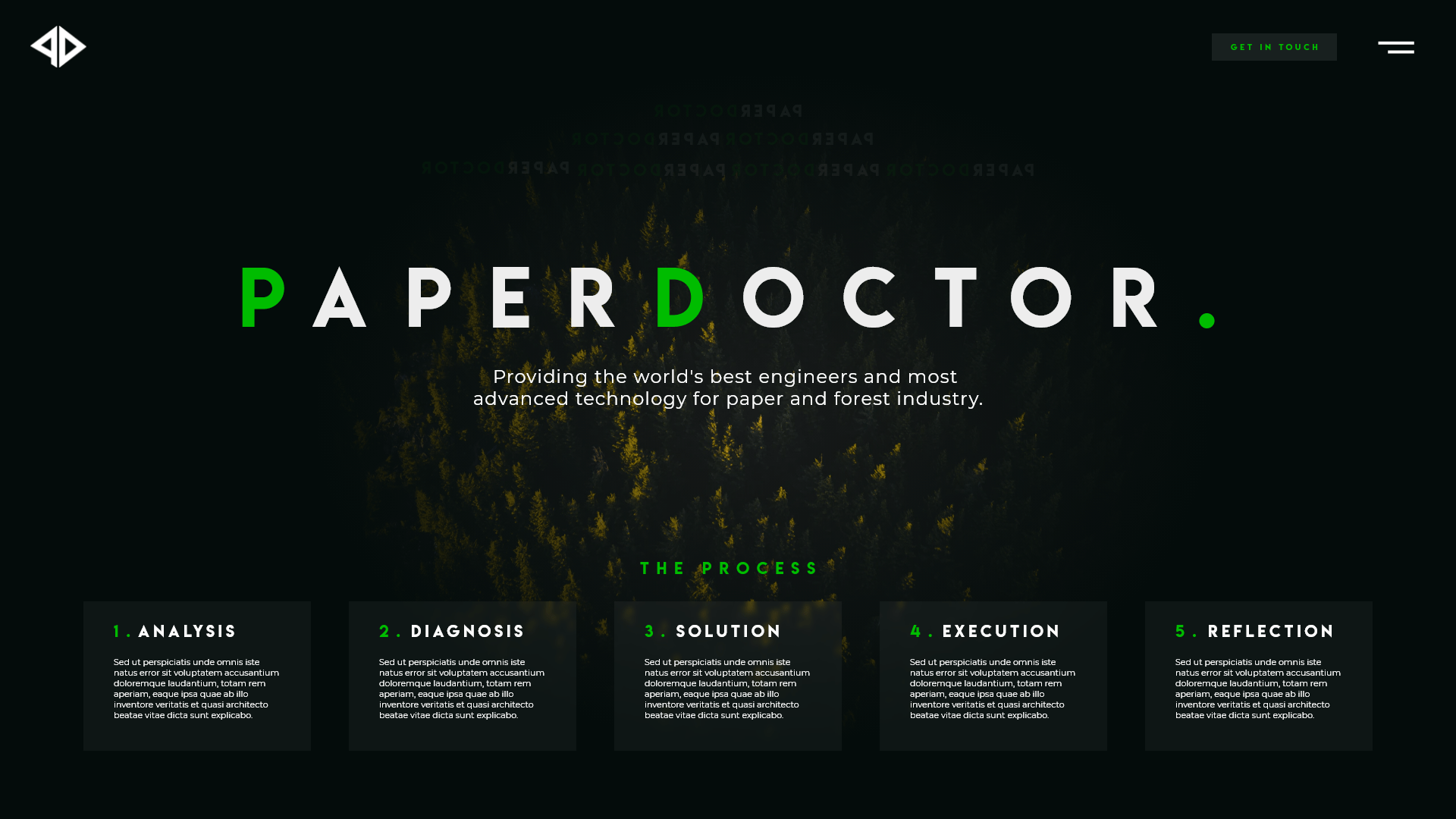
Paper Doctor is a daughter company to Nordicforestpaper. They are a consulting company for big big paper machines particularly in Asia. I decided that, after re-designing nordicforestpaper's website (the conceptual one), I would make a landing page header design for them.
NOTES/THOUGHTSIn this design, I mainly focused on simplicity, and visual satisfaction. I wanted the view to sort of resemble that of a camera panning over a forest. So I selected an image that gave that angle, and I put a radial vignette over it. The colour selection is that of green as the company works in the paper industry, and is related to the colours of the forest. I then picked a brighter green colour as the theme colour that pops. The company name would be in the centre, with its slogan right underneath it. And at the bottom of the header, there would be a quick step-by-step list on how their consulting works. This encourages the viewer to understand what the company provides quicker, thus possibly ensuring a quicker service request time. As you can imagine, I had the idea that when scrolling down, the viewer would feel that they are falling into the forest; dwelling deeper into what the company does.


Impakt Oy
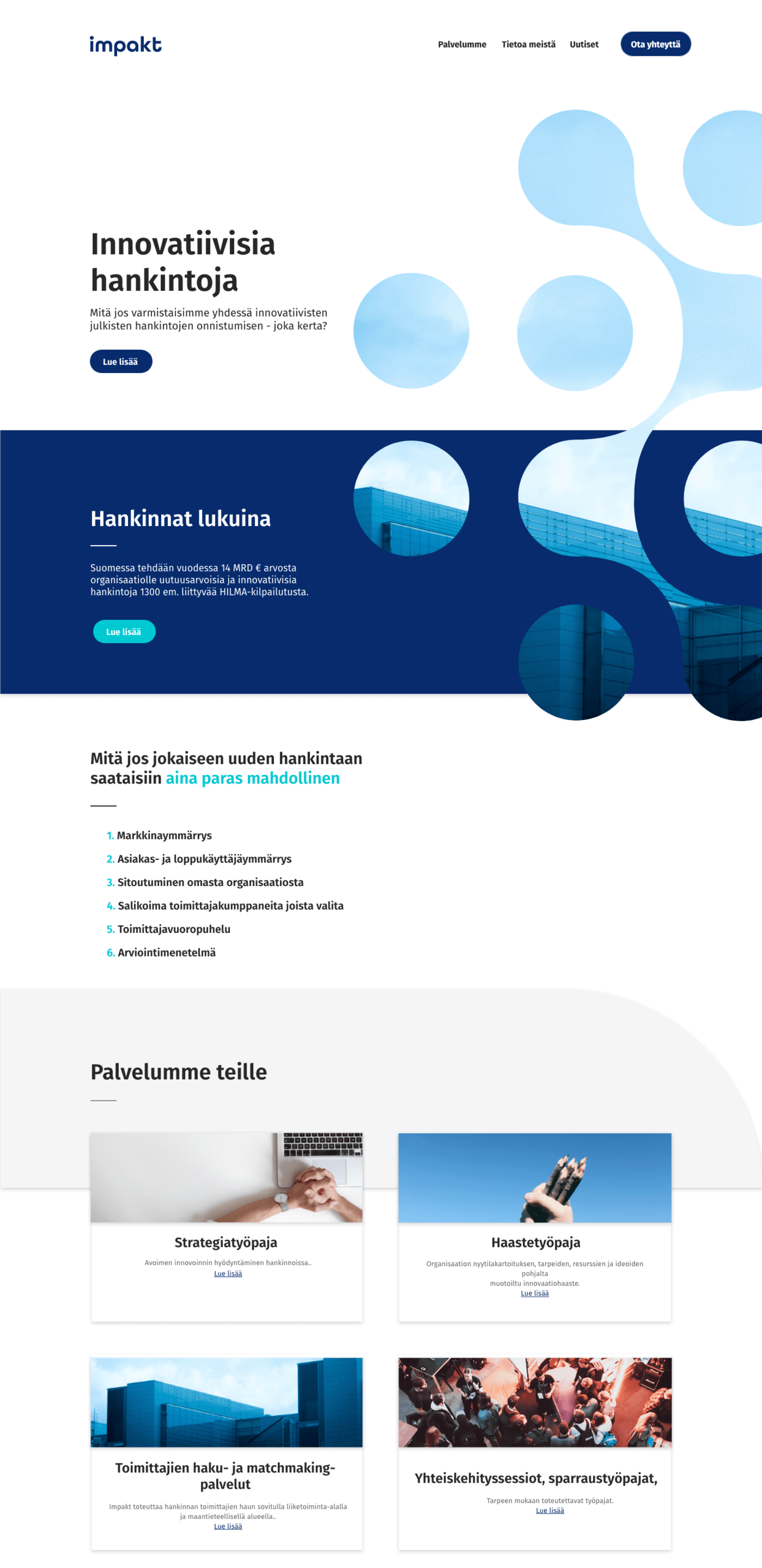
I worked for Impakt as a freelancer to develop their website. The CEO contacted me as I had worked for him in another company, and asked if I could develop their website in less than 2 weeks. He told me he had a design already, and all I had to do was develop it. So, this seemed quite straight forward, and though some things were hard, most of it was very straight forward. Unfortunately the website now has a different design... So I can't link it, but anyways they were happy with my work.
NOTES/THOUGHTSNo design thoughts here, there were some minor design changes, but nothing major to be mentioned here.
Chiang Khao Restaurant
http://changkhao-thai.fi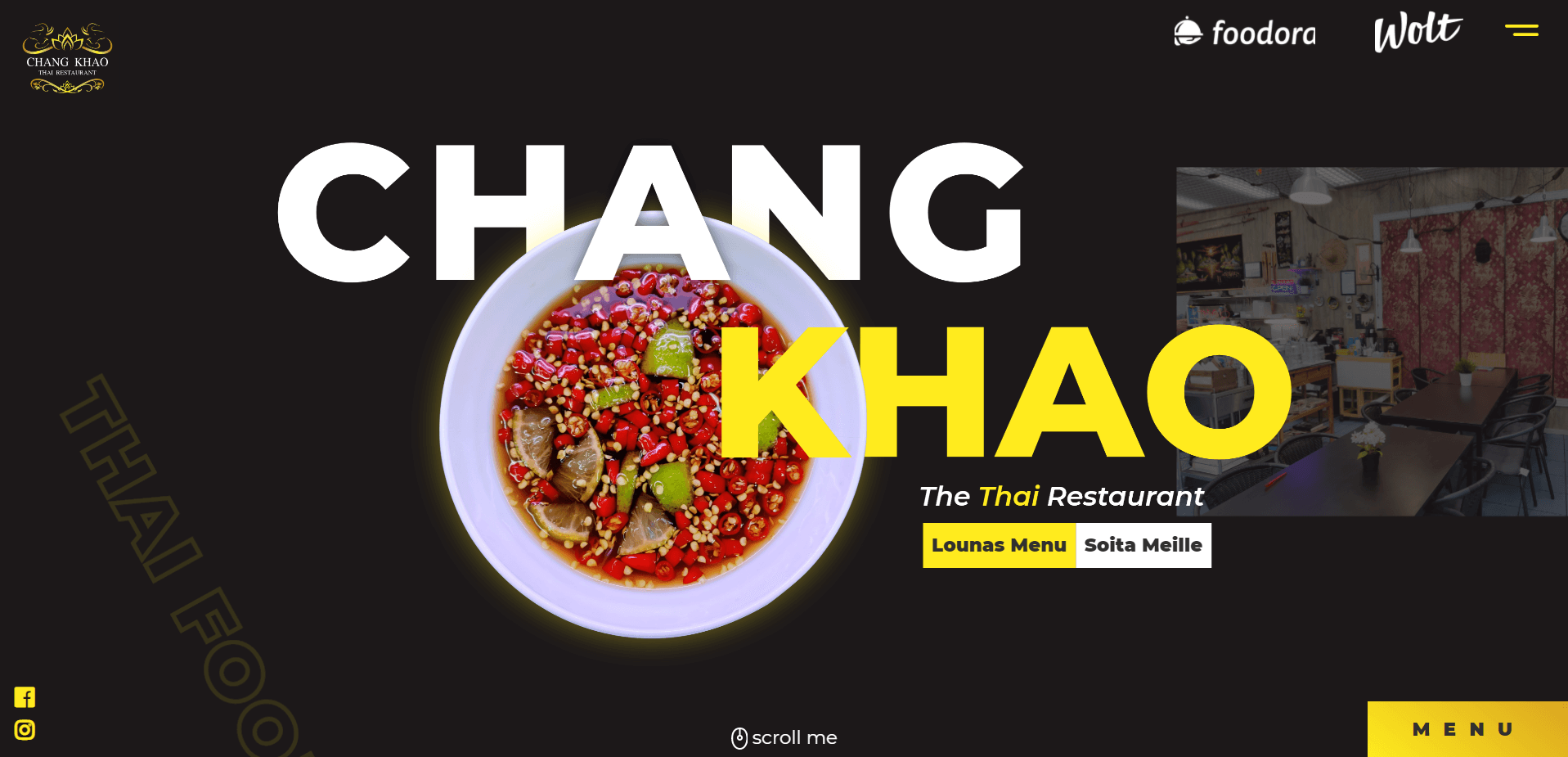
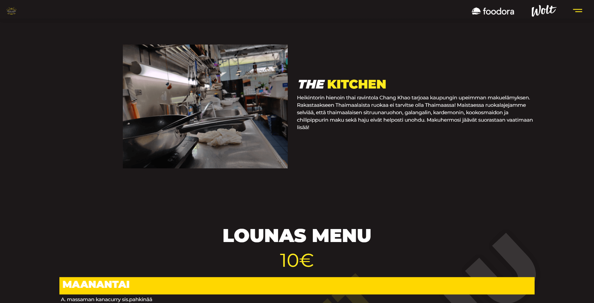
This website was also one of my first ones I had designed and developed for a company. You can probably see how old it is and how much my current designs differ from it. However, at the time.. Which was in like 2018, it was one of my better designs. This restaurant had a non-functioning website, and I thought that I'd re-design and make it. They had no requests, so it was quite a free road for me.
NOTES/THOUGHTSThe design itself was straight forward. Get a good header, and have a menu list at the body, and then a contact section. I focused mainly on the header design, as I wanted that to be more special. I decided on this because you could ask, How does one make a menu look more appealing whilst keeping it compact? And is it a good idea to make it look special, possibly making it harder to comprehend? For me, I found that keeping the menu simplistic is the best, and that is why I focused on the header.
Looking back now, the header doesn't look that good. I understand what I was going for, but if I re-did it, it would look a lot different. The idea I had was for one of their dishes to be integrated into their restaurant name. So I did that with a sauce dish that looked vibrant. They also needed the food app logos so that the customers could order from online. The placement and looks of it is very bad. They needed a button that went to their menu, which I had put in the bottom right. And then social media and call to action buttons. Nothing else to talk about, I don't like this design THAT much but the owner was satisfied.
DOTR (Conceptual)
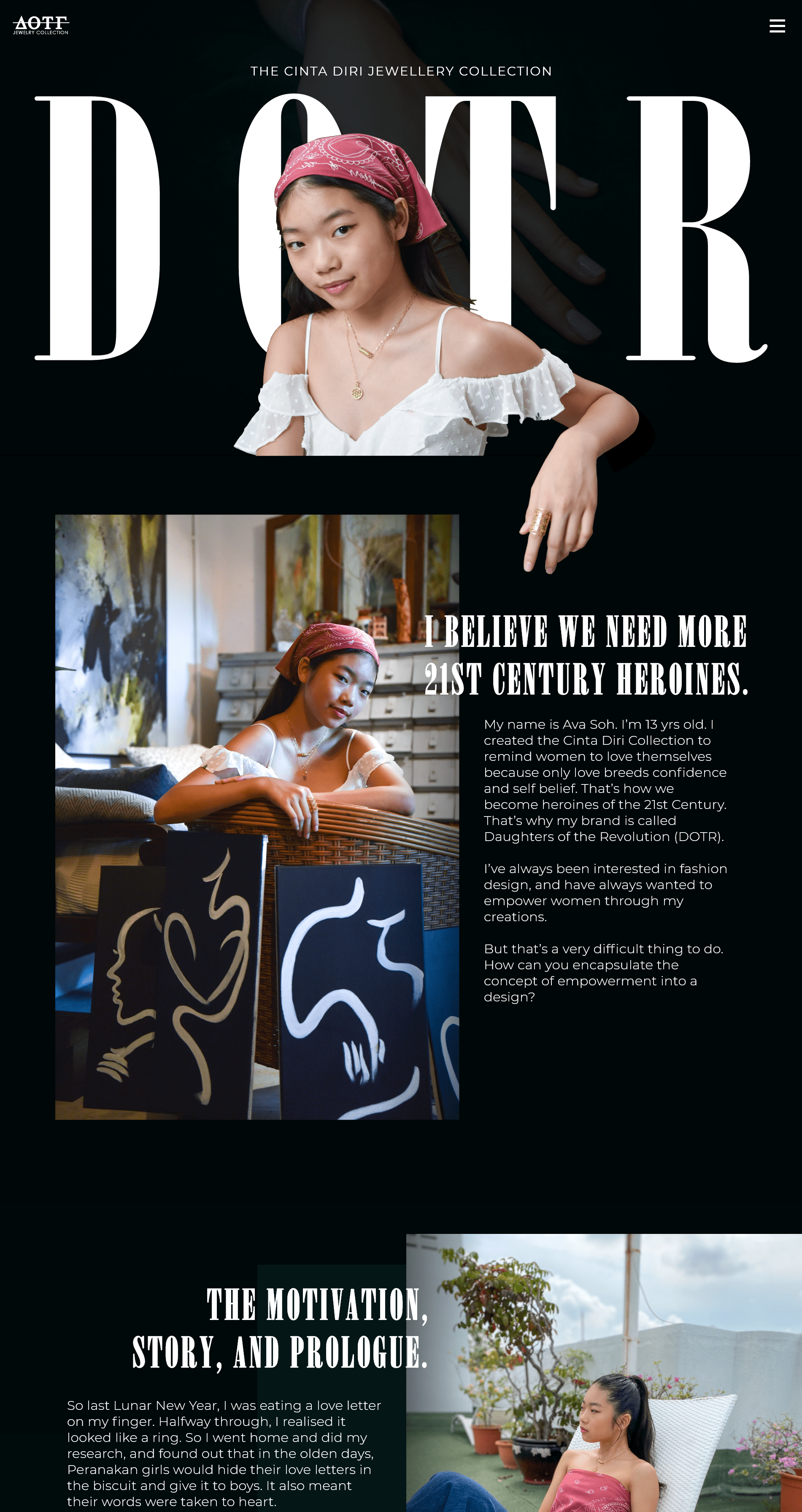

A friend of mine's sister was creating a jewellery collection with Willow Smith as a project to raise awareness for women's empowerment and their leadership roles. I saw her collection, and immediately had an idea for a web design. I didn't want it to be like any other jewellery store. I wanted it to have its own thing, sort of like its own identity one could say. I reached out, and she agreed. Although I was very late on this one, and eventually didn't have the time to complete it (I was in my highschool exam time), I still am proud of what I had made, and feel like its worth showing on here.
NOTES/THOUGHTSThe design of the first page itself is very sort of characteristic of me. You can see the header is quite similar to my own personal website, with the founder of the company in the foreground, the collection name in the middle ground, and a picture of one of the products in the background. The colour was chosen based on the material that the hand and ring were laid on, and the font was chosen as a serif font to be more classy. As you scroll down, I wanted the founder's motivation, mission, and goals to be clear to the viewer. This gives the viewer a more intimate connection, and thus could find more meaning in the products; leading to a purchase.
The second page would be the store, where you would view the products and buy them. It is quite straight forward, but also modern and beautiful... Almost like an art museum, but as a website. I liked the pictures she had sent of her products, this batch with a different background, a more correlative artistic background. The black and white really spoke to me, so I decided to base the colour map of this website off of the ones you see in the picture. I added a bit of a dull sea blue just to contrast the gold colour. The black and white along with the component structure in my opinion made this website look very modern and beautiful. One thing, in the product part, I actually added more pictures of the product so that the viewer could see more of the product. It sadly isn't in this artboard, but is in the picture below.

xJourney
This was my latest work. A company called StuDisco had an idea for a health app, of which I cannot get into detail. They gave me the general direction of the app, and although they did tell me what they wanted, they could not give me any real specifics. Thus, I had to go as far as making up my own ideas for the app at some points as THEY didn't even know what to have at said places of the app. This happened on multiple occasions, and thus this app was never finished. I was given the lead designer role, and not the director nor product lead. However, despite this issue, I decided that it would be a great place to "step-up" as a designer, and take some product lead role into my position.
NOTES/THOUGHTSI can say some things about the app. For example, the colouring. I chose a light green colour, as opposed to bright red, or orange that I originally had. I picked the light green because the bright red felt too clinical.. And the orange was already picked by a competitor app. The colour green gives the user a reminder of nature, trust, positivity. And thus was a perfect choice for the health app. For accessibility purposes (a crucial part of the app design as requested from StuDisco), certain components of the app such as the font, sizing, and icons had to be tailored to their desire. There are many more components of the app that I designed with lots of thought, but I cannot get into them as that would reveal exactly what the app is about. This is one of my proudest app designs and StuDisco's dev team as well as the CEO were very happy with my designs.
Oras App Challenge
https://youtu.be/PwkjKIm6KYc
I participated in Junction Hackathon 2021 doing the Oras challenge. This challenge asked for the task-takers to visualise the amount of water one consumes in a "fun way" which was to be finished in 48 hours as the event lasted from Friday afternoon to Sunday morning. So I lead my team to design and make a semi-functioning app that would display the amount of water used by the user. Nothing crazy. The design had no restrictions and no boundaries. The sort of only barrier was time, as it is a bit difficult to design and fully create a functioning app that works off of live data in 48 hours.
NOTES/THOUGHTSThe app design doesn't have anything special, quite a basic app you would see in the app store that stores and shows data. So for example, we have displayed the numbers of litres used per shower, or we have shown the average temperature that the user uses. The fun part that we added into the app was a leader board system where a neighbourhood's lowest usage of water household would be displayed. So in a sense we made using less water as a competition. There was nothing more to the app.
Along with the app, we actually developed a VR solution to water pipe leakages and various solutions for leakage detection as part of the challenge. You can see this in the video I linked to this project. We won 3rd prize in this challenge.
HKScan App Challenge
https://youtu.be/PwkjKIm6KYc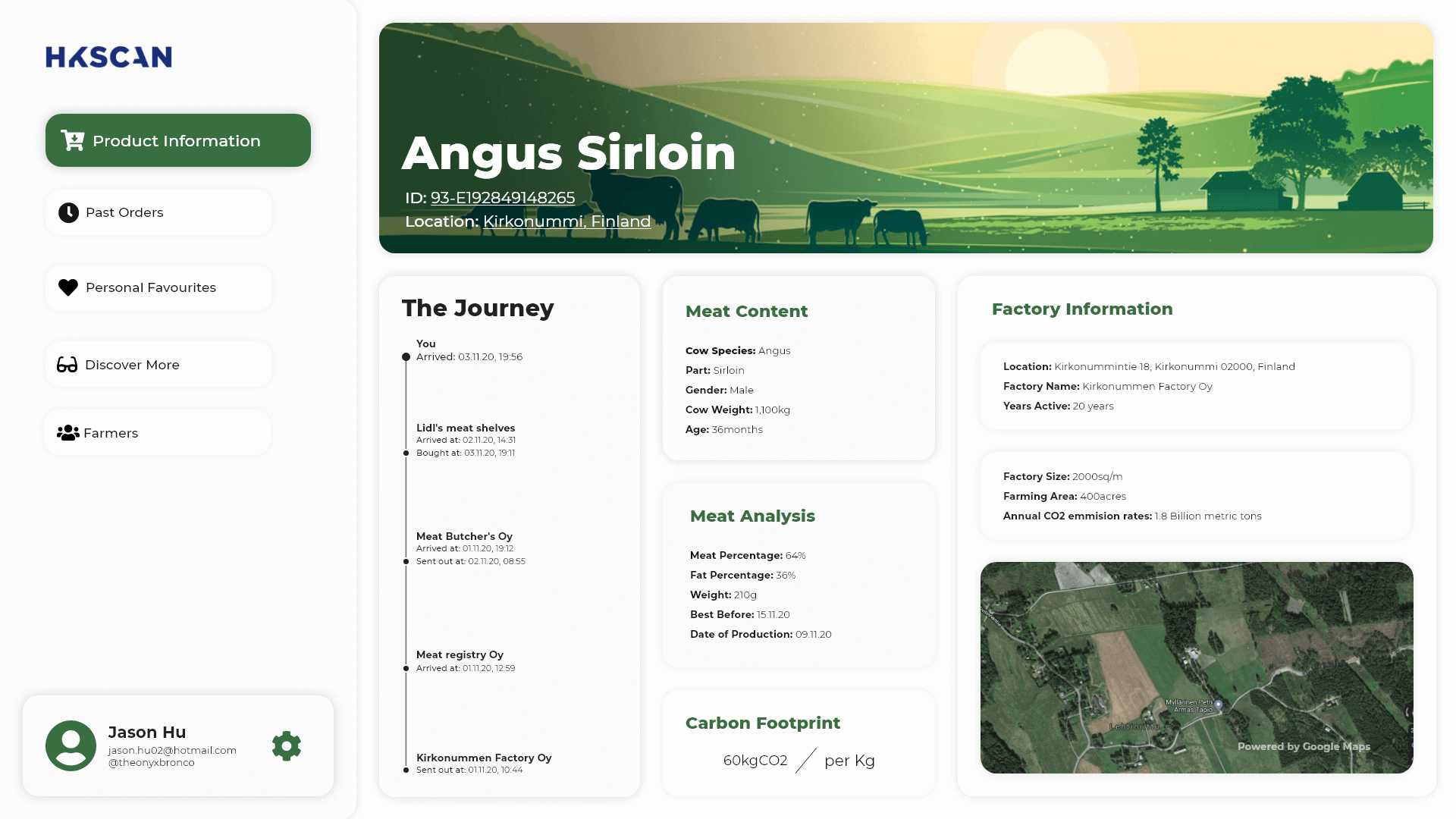
Another Challenge from Junction but this time in 2020, I was in a team of 5 and participated in a challenge by HK where the goal was to let the user know where their food was coming from and what properties the food had. The solution we had was to come up with a QR code system that would be on every product. When searched, the QR code would take you to a web-app or app that would then display all of the information concerning the food item.
NOTES/THOUGHTSHere, you see that I designed a dashboard that showed information of certain food items that the user has bought. The user is able to tag favourites of food that they have bought, and able to see the journey and location from where their food came from. There isn't anything crazy to this as again it was a 48 hour challenge, and designing and making a working web-app is not the most ideal thing to do in this time-frame. However, I was still able to create a semi-good looking dashboard with all of the information needed. We did not win anything :/
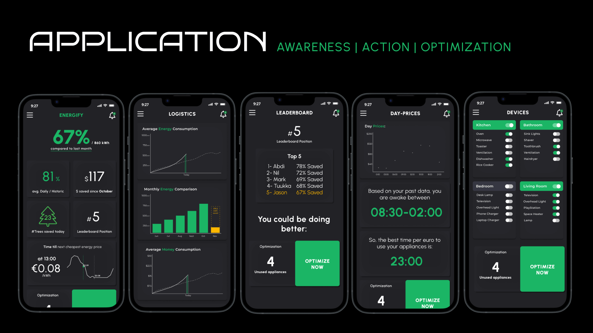
BCG Energy Saving Challenge
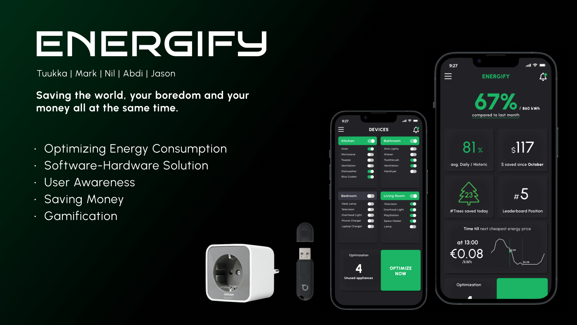
2021's Junction Hackathon finally came around, and this time I went in with the same team that I did in the previous year's Junction hackathon with one more addition. The challenge was given by BCG, one of main big three consulting firms; asking to mitigate energy consumption with the onset of an expected energy crisis. So, our solution was a combination of hardware and software. I lead the whole project looking over the product development, and in the end we delivered a smart-home solution that used a location based on-off switch for household appliances in combination with an algorithm that optimizes building heating based on activity density. This product got us 3rd place in the challenge, and an overall top 6 in the whole hackathon (which had 1500 participants, all in a team of 5 each).
NOTES/THOUGHTSThe development phase heavily outweighed the planning phase, as we ran into more trouble than we anticipated. For example, when we tried to create the algorithm (AI) for optimizing heating, we couldn't find good datasets to find correlations. So we had to re-think the datasets we would use many times. That cost us around 12 hours of development time. Also, the hardware was not performing as consistently as expected, thus we had to brute force a solution fast due to the 48 hour time-limit we had on this challenge. Thanks to a hardware specialist on our team, we were able to fix it in time for the presentation. The app design part was done by me, and was also partially developed by me. All presentation material was also designed and produced by me, but the product couldn't have been as it was without the whole team. Dream team yet again.